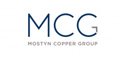
Mostyn Copper Group identity
Mostyn Copper Group came to us with a request to assist in helping them position and start to market their new business. Although the Directors had extensive experience in the interior fitout, design and construct arena, doing it for themselves was an entirely new venture. They had the business name and some rough ideas but little else and so asked how they might bring the business and brand to market. Although the team had a clear target audience, it was still unsure on how to pitch this new offer to them and what key attributes it needed to convey.
Being new to market, the identity had to be seen as credible, professional and ‘solid’ (in the sense that it would help imply a company with solidity and structure). The brief detailed a need for a contemporary look and with a bias to the 3 letterforms as the primary identifier, rather than the full business name. In addition, the team asked howe we could represent their suite of services under the identity.
We undertook a series of Q+A sessions, researched the competitive arena and drew on our experience in the design and construct industry to determine an appropriate creative strategy. From this, we developed our conceptual structure, showing how we saw the letterforms being represented. Importantly, we recommended that the full name also be included – being a new entry to the market it was important that ‘MCG’ became synonymous with Mostyn Copper Group from the outset. Our concept also demonstrated thinking on how we would start to create differentiation – in this case, customising the ‘G’ letterform.
From this, we were then able to build a supportive brand language, in the shape of service icons, using a strong, contemporary colour palette. The result is a simple but effective identity that we subsequently rolled out to website and core collateral.
ClientMostyn Copper GroupServicesIdentity
